
Double Page Research
Posted by George Butter | Posted in | Posted on 09:07
0
The front cover of a magazine is important for catching the audiences eye but the inside of the magazine and the content is what keeps the readers coming back for more, below I have analysed techniques used by the industry to keep their audiences attention.
MixMag
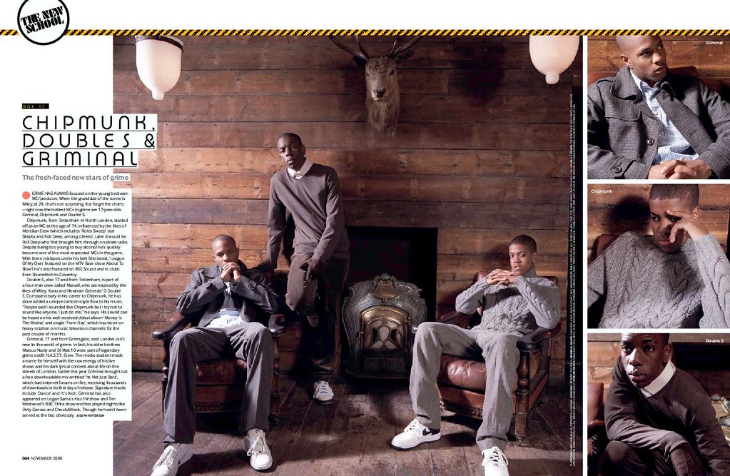
The mise en scene has been create to give a luxurious feel to the article maybe attracting the interest of readers that like the thought of the lifestyle. The old school luxury look has been kept appealing to the readers, who might not otherwise be interested in this, by using small things such as the fact they are wearing trainers and their relaxed poses.
All of the colours used on this double page are quite neutral so that your eye isn't drawn to just one area of the page.
RINSE
 This double page by Rinse is highly simple but is highly aesthetically pleasing. Their use of colour is what makes this page work, matching the background colour to the picture of the artist. Using block colour is what keeps the page looking fresh and simple, they haven't over complicated the page. The font they have used for the heading goes well with the genre of magazine quite a modern font. The white goes well with the olive green they have used. as they don't clash but the white is still easy to read with the green behind.
 The font that has been used for the rest of the article is just a simple sans serif font which isn't very interesting to look at but is easy to read.
Rinse magazine contains a lot more text than other magazines. It is also not very usual to see two double pages for one article but Rinse has quite a niche market and they are appealing to the more intellectual audience. In the second double page they have also brought across the same colour scheme instead of matching it to the other photo making use of the olive green in small areas of text.
The photography has been kept quite simple and perhaps not a lot of thought has gone into it and more into the written content more.
ATM

A simple catch phrase "Less is More" titles this article in a translucent text I think this works well it is catchy and looks good and sort of initiates the article and perhaps draws the reader attention more than the big block of text at the bottom would.
Knowledge Magazine

Kmag have photographed their artist in an urban environment the sort of environment which the target audience can relate to and therefore relate to the artist. They also have there artist dressed in affordable casual but still good looking clothes. The photo effects they have applied to the photo in the background look good but don't really appeal to me. I don't think this sort of effect would really appeal to the target audience of this magazine either.
In the main article the text has been split up using different fonts relating to other things just small comments used to break down long paragraphs which isn't very appealing to the casual magazine reader.


Comments (0)
Post a Comment