First drafts
Posted by George Butter | Posted in | Posted on 04:32
0


The front cover of a magazine is important for catching the audiences eye but the inside of the magazine and the content is what keeps the readers coming back for more, below I have analysed techniques used by the industry to keep their audiences attention.
MixMag
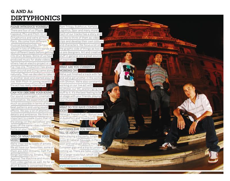
 This double page by Rinse is highly simple but is highly aesthetically pleasing. Their use of colour is what makes this page work, matching the background colour to the picture of the artist. Using block colour is what keeps the page looking fresh and simple, they haven't over complicated the page. The font they have used for the heading goes well with the genre of magazine quite a modern font. The white goes well with the olive green they have used. as they don't clash but the white is still easy to read with the green behind.
 The font that has been used for the rest of the article is just a simple sans serif font which isn't very interesting to look at but is easy to read.


I did most of my font research using dafont.com and 1001freefonts.com they have a large selection of free fonts, after trawling through picking out my favourites I downloaded them all, I may not use them all but as they are free I decided to get lots.


I wanted the title of my magazine to portray what the magazine is about, such as Kerrang! and mojo they both suit there genres well. To come up with a name that I thought would suit my magazine well I though about terminology and slang and existing names of artists and magazines. I came up with a few ideas but couldn't choose which I wanted to use. I narrowed it down to 5 that I liked;
DubPhonicsHYPEDropRevolutionSampl
I can picture them each as stylish logos but I wanted to see what other people thought of the names I had come up with so I asked twenty people that listen to this genre of music which name they like the most. I have displayed the results in a graph below.

 ATM or Atmosphere magazines front cover is much more contemporary. The logo is clean cut, stylish and simple, but just as recognisable as Kerrang!'s logo. On every issue of ATM the logo is positioned in the same place however the colour often changes to complement the colours in the main photo. The main photo always fills the whole front cover and is the only photo as opposed to other magazines which use a range of framed photos. Instead of using photos and short sentences to display other articles inside, ATM magazine just use a list of artists, this keeps the front cover looking simple and stylish.
 In a very similar style to ATM, Knowledge Magazine or Kmag use a just one image which fills up the whole page they then just use writing to display other articles. All photos used are from photo shoots rather than taken from events or paparazzi photos. This is what keeps both of these two magazines looking stylish and creative.
 Kmag uses more graphical decorations than ATM. These decoration are always simple and go well with the rest of the features on the page. White is always used in the logo and the white bar that the bar code is on, then they use only one more colour which goes well with the background photo. The featured artist in each issue always have there name written in the centre of the cover. and the artists are always dressed in modern up to date clothes that would appeal to the target audience.
 Jockey Slut is a much older magazine but it is still an iconic magazine. Jockey Slut wasn't just about the music is was about the culture and lifestyle. Featuring what are now cult bands, reference to drugs and use of dialect and slang in their articles Jockey Slut really drew in their target audience.
 The front page features reviews, interviews and a range of other articles. The trademark logo completely consistent through every issue always in the same position and never behind the main photo. The logo is simple and easy to recognise, and although isn't hugely aesthetically pleasing it always compliments the rest of the page.

I have chosen the print option for my AS media coursework. I wanted to work by myself, and I found that doing the film option would be difficult to pull off by myself. I have also decided that my magazine will be music based as I think it can be creative yet still something that I could achieve, it is also something that I have some knowledge about. To start my research below I have created a list of magazines that I want to analyse.


