Evaluation

Posted by George Butter | Posted in | Posted on 07:17

0

Media Evaluation


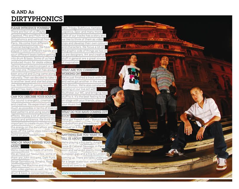
One convention of music magazines that I have used in my own media production is the use of a studio photo starring one main artist. This convention isn’t used by all music magazines, however the genre I have chosen which is; Dance, Techno and Drum & Bass this is convention that is commonly used and is a convention which was used in every example that I found and researched. Having a studio photo as apposed to a live photo makes the magazine look much more professional and therefore the consumer is likely to pay more for the product. Magazines such as ‘Kerrang!’ use multiple pictures to attract their audience; this makes it look as though there are lots of things going on inside the magazine. The magazines I looked at only ever had one main photo and just used text to describe the articles inside. This keeps the front cover looking modern and fresh. The graphics I have created for my magazine are simple and angular shapes, not only is this a convention used by the genre of magazine I have studied but appeals to my target audience; males. Products targeted at females tend to use curvier and elaborate shapes. All of the fonts that I used were simple and easy to read, this means that the fonts suit the style of the rest of the magazine and also appeal to my audience.


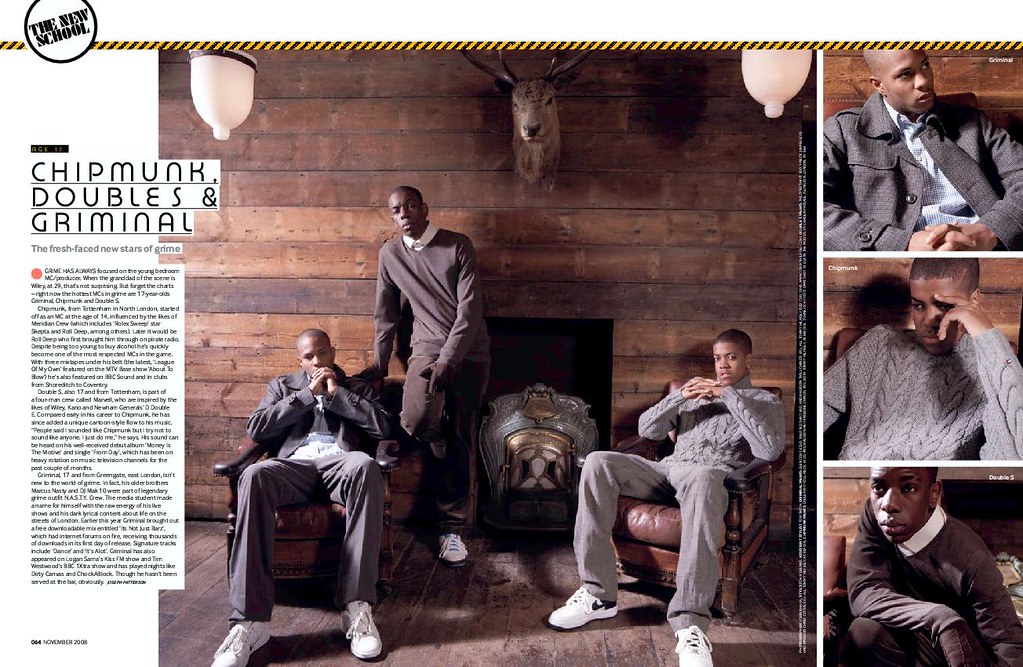
In my media production I have represented young people. Some people may see that I have represented young people in a negative way, but I think the way they have been represented will address my target audience. One of my photo shoots features graffiti in the background and perhaps represents young people as criminals. The clothes that my artists have worn for the photo shoots are casual and urban, this clearly signifies that they are working class people but I feel I have represented working class people as fashionable people. This is appealing to the target audience who are also working class people but are the sort of people that would be interested in current trends. In the magazines I looked into there wasn’t any features where the artists were playing instruments, despite this I have included pictures like this in my magazine as I think other musicians will find this interesting and it also represents my artists as talented. Unfortunately I don’t know many people of different ethnicities so I wasn’t able to include this in my magazine, I think this would have enhanced my media production and appeal to a wider market.


Other magazines of a similar genre have been distributed by companies such as IPC, Phoenix publishing, or EMAP which is now Bauer media. I think a similar publishing company would be suitable for my magazine. Bauer Media covers such a wide range, not just magazine. They own TV channels, Radio stations, websites and over 58 magazines. Having such a large range of experience and scope over the industry would be very beneficial for a magazine producer. However Bauer media don’t focus on any particular genre and therefore might not be as able as smaller companies such as Phoenix publishing to distribute the magazine to the right audience. Big distributors such as Tesco, ASDA and WHSmith would be able to distribute my magazine adequately but my magazine would also need to be promoted and distributed via the internet and events because my market is more niche than that of more mainstream magazines.


The target audience for my magazine is males but I think despite this it will also be appealing to men. Similarly FHM is target solely at men but it also has a female fan base. The age I have targeted is around the age of 20. However drum and bass has been around for a long time but has always been quite underground therefore I think my magazine would appeal to people aging from as young as 16 to as old as 30. I have priced my magazine at £4.00 because other monthly magazines such as Q, which is £3.90, Metal Hammer is £3.99, mixmag is £4.20, Djmag is £3.95,

Final Drafts

Posted by George Butter | Posted in | Posted on 02:15

0

Front Cover


Double Page Spread


Contents Page


Evaluation

Posted by George Butter | Posted in | Posted on 09:13

0

User Feedback

Posted by George Butter | Posted in | Posted on 09:10

0

Double page spread

Posted by George Butter | Posted in | Posted on 09:05

0

Contents Page

Posted by George Butter | Posted in | Posted on 09:00

0

Front Cover

Posted by George Butter | Posted in | Posted on 03:41

0

First drafts

Posted by George Butter | Posted in | Posted on 04:32

0

Initial sketches

Posted by George Butter | Posted in | Posted on 04:29

0

Shoot 3

Posted by George Butter | Posted in | Posted on 04:15

0

Shoot 2

Posted by George Butter | Posted in | Posted on 04:15

0

Shoot 1

Posted by George Butter | Posted in | Posted on 04:15

0


Feature Ideas

Posted by George Butter | Posted in | Posted on 01:45

0


Q and A
In Kmag they have used question and answer with a iconic artist in the drum and bass scene as a feature, many readers will find this interesting. This is quite a simple way of creating an article and definitely a feature I could use in my own magazine.


Events and Gigs

Contents Page Research

Posted by George Butter | Posted in | Posted on 01:45

0

DJ MAG


Double Page Research

Posted by George Butter | Posted in | Posted on 09:07

0

The front cover of a magazine is important for catching the audiences eye but the inside of the magazine and the content is what keeps the readers coming back for more, below I have analysed techniques used by the industry to keep their audiences attention.

MixMag

Mixmag's double page spread mainly features a photo shoot with just a small column of writing this short articles keep the reader interested, depending on what the genre of magazine is the reader is not going to want to see large amounts of block text. The small amount of the text that there is is written in a simple font and is written in an informal style. I like that the text has a white box around it and this slightly encroaches on the picture it makes the text and the picture go well next to each other but still has a clear separation.

The mise en scene has been create to give a luxurious feel to the article maybe attracting the interest of readers that like the thought of the lifestyle. The old school luxury look has been kept appealing to the readers, who might not otherwise be interested in this, by using small things such as the fact they are wearing trainers and their relaxed poses.

All of the colours used on this double page are quite neutral so that your eye isn't drawn to just one area of the page.


RINSE
This double page by Rinse is highly simple but is highly aesthetically pleasing. Their use of colour is what makes this page work, matching the background colour to the picture of the artist. Using block colour is what keeps the page looking fresh and simple, they haven't over complicated the page. The font they have used for the heading goes well with the genre of magazine quite a modern font. The white goes well with the olive green they have used. as they don't clash but the white is still easy to read with the green behind.

The font that has been used for the rest of the article is just a simple sans serif font which isn't very interesting to look at but is easy to read.

Rinse magazine contains a lot more text than other magazines. It is also not very usual to see two double pages for one article but Rinse has quite a niche market and they are appealing to the more intellectual audience. In the second double page they have also brought across the same colour scheme instead of matching it to the other photo making use of the olive green in small areas of text.

The photography has been kept quite simple and perhaps not a lot of thought has gone into it and more into the written content more.


ATM
Atmosphere magazine think about there photography a lot more than rinse have using different and it has paid off. This photo is definitely appealing to ATM's target audience. Capturing the artist in a cool way dressed in the latest fashion this photo has also really captured their attitude and personality. It's much more informal than Rinse and the artists look in their element here.

A simple catch phrase "Less is More" titles this article in a translucent text I think this works well it is catchy and looks good and sort of initiates the article and perhaps draws the reader attention more than the big block of text at the bottom would.


Knowledge Magazine


Kmag have photographed their artist in an urban environment the sort of environment which the target audience can relate to and therefore relate to the artist. They also have there artist dressed in affordable casual but still good looking clothes. The photo effects they have applied to the photo in the background look good but don't really appeal to me. I don't think this sort of effect would really appeal to the target audience of this magazine either.

In the main article the text has been split up using different fonts relating to other things just small comments used to break down long paragraphs which isn't very appealing to the casual magazine reader.


djmag1.jpgdjmag2.jpg

Font research

Posted by George Butter | Posted in | Posted on 08:59

0

I did most of my font research using dafont.com and 1001freefonts.com they have a large selection of free fonts, after trawling through picking out my favourites I downloaded them all, I may not use them all but as they are free I decided to get lots.


  • Harabara
  • Abode
  • Asenine Super Thin
  • Blippo
  • N-Gage
  • Oasis
  • Reboard
below I have tested them out with some of the initial name ideas.


Logo Research

Posted by George Butter | Posted in | Posted on 08:37

0


logo

DJ magazine logo

All of the logos above are relatively simple and are made mainly by their fonts, with a few simple shapes or designs to give them an interesting element. After seeing this I can see that I will have to consider all of my fonts carefully, I am going to research and create a list of fonts that I think will suit the style of my magazine.

The Questionnaire

Posted by George Butter | Posted in | Posted on 07:50

0

I wanted the title of my magazine to portray what the magazine is about, such as Kerrang! and mojo they both suit there genres well. To come up with a name that I thought would suit my magazine well I though about terminology and slang and existing names of artists and magazines. I came up with a few ideas but couldn't choose which I wanted to use. I narrowed it down to 5 that I liked;


DubPhonics
HYPE
Drop
Revolution
Sampl

I can picture them each as stylish logos but I wanted to see what other people thought of the names I had come up with so I asked twenty people that listen to this genre of music which name they like the most. I have displayed the results in a graph below.

Name Ideas

Posted by George Butter | Posted in | Posted on 07:40

0

Plan of action

Posted by George Butter | Posted in | Posted on 07:11

0

  1. Magazine names
  2. Magazine logos
  3. Font research
  4. Double page spread research
  5. Feature Ideas
  6. Photo shoots
  7. Photo editing
  8. Final Logo
  9. Cover stories
  10. Cover Image
  11. Drafts
  12. Final productions

Initial Ideas

Posted by George Butter | Posted in | Posted on 06:36

0


Research

Posted by George Butter | Posted in | Posted on 03:13

0


To kick start my project I wanted to look at existing magazine covers for inspiration and ideas on how I wanted my magazine to look. I have analysed each magazine cover commenting on individual aspects and how and why each aspect works. This exercise not only gave me ideas for my own magazine but helped me understand industry methods and conventions, which will allow me to create my own professional magazine.


Kerrang!'s logo is so iconic that you can still see that this is a Kerrang! magazine even when a large amount of it is hidden. On the majority of their front covers (excluding some of the new ones) They have kept this logo the same size position and colour throughout their huge number of issues. I like this logo it is completely in tune with the genre of their magazine the font used is grungy however it isn't to over the top. I think the simplicity of it is what makes it so recognisable.

On Kerrang!'s front cover there is often a lot going on. This gives the feeling that there is loads to see and read inside the magazine however in my opinion it is a bit of an eyesore all of these articals trying to grab your attention at the same time.

They have limited themselves to four major colours, red black white and gold. I think this is a good idea as this front cover is busy enough without throwing in a rainbow of colours.

Kerrang! often do a poster special, using a freebie to attract an audiences attention is always going to work, especially when the audience of this magazine pay for posters.


Next I decided to look at a different genre of music to compare and analyse different techniques used in the industry to attract different audiences.
ATM or Atmosphere magazines front cover is much more contemporary. The logo is clean cut, stylish and simple, but just as recognisable as Kerrang!'s logo. On every issue of ATM the logo is positioned in the same place however the colour often changes to complement the colours in the main photo. The main photo always fills the whole front cover and is the only photo as opposed to other magazines which use a range of framed photos. Instead of using photos and short sentences to display other articles inside, ATM magazine just use a list of artists, this keeps the front cover looking simple and stylish.

The main photo always features one artist, like in all of the magazines I have looked at the photos are always studio quality rather than that of hello magazine where the photo is often taken by paparazzi. The artist is also always dressed in a way that appeals to the target audience.

Like K! Atmosphere magazine use a freebie to attract readers of the target market. After comparing the two magazines I have decided to go down the route of a contemporary styled front cover as I think this is much more creative and aesthetically pleasing.


In a very similar style to ATM, Knowledge Magazine or Kmag use a just one image which fills up the whole page they then just use writing to display other articles. All photos used are from photo shoots rather than taken from events or paparazzi photos. This is what keeps both of these two magazines looking stylish and creative.

 Kmag uses more graphical decorations than ATM. These decoration are always simple and go well with the rest of the features on the page. White is always used in the logo and the white bar that the bar code is on, then they use only one more colour which goes well with the background photo. The featured artist in each issue always have there name written in the centre of the cover. and the artists are always dressed in modern up to date clothes that would appeal to the target audience.

Kmag also include a CD as a free gift to attract the target market, this is something I am considering using on my magazine.


Jockey Slut is a much older magazine but it is still an iconic magazine. Jockey Slut wasn't just about the music is was about the culture and lifestyle.  Featuring what are now cult bands, reference to drugs and use of dialect and slang in their articles Jockey Slut really drew in their target audience.

The front page features reviews, interviews and a range of other articles. The trademark logo completely consistent through every issue always in the same position and never behind the main photo. The logo is simple and easy to recognise, and although isn't hugely aesthetically pleasing it always compliments the rest of the page.

Unlike other magazines Jockey Slut didn't try to get appealing and clean photos the artists they featured were always in their true form and it wasn't unusual for this person the be smoking or drinking alcohol.


RNS001 CoverRNS007 Cover


Rinse is the leading drum and bass magazine. I hugely like there Front cover each issue keeping the white bar down the side the only thing changing is the picture and the coloured part of the logo. The white bar captures and displays the cover stories and also the promotion.

There main photo is often quite creative and has had subtle affects applied to it. The main photo are always quite unusual but still look really good and stylish.

After the logo the next biggest piece of writing is the promotion. this is a good way to make it stand out to potential buyers but to still be quite stylish and subtle.